Brand
Everything here is generated from one file, branding/build.py, and checked before it is
written. The full guide, the source files and the measured report live in the
branding/ folder.
The mark
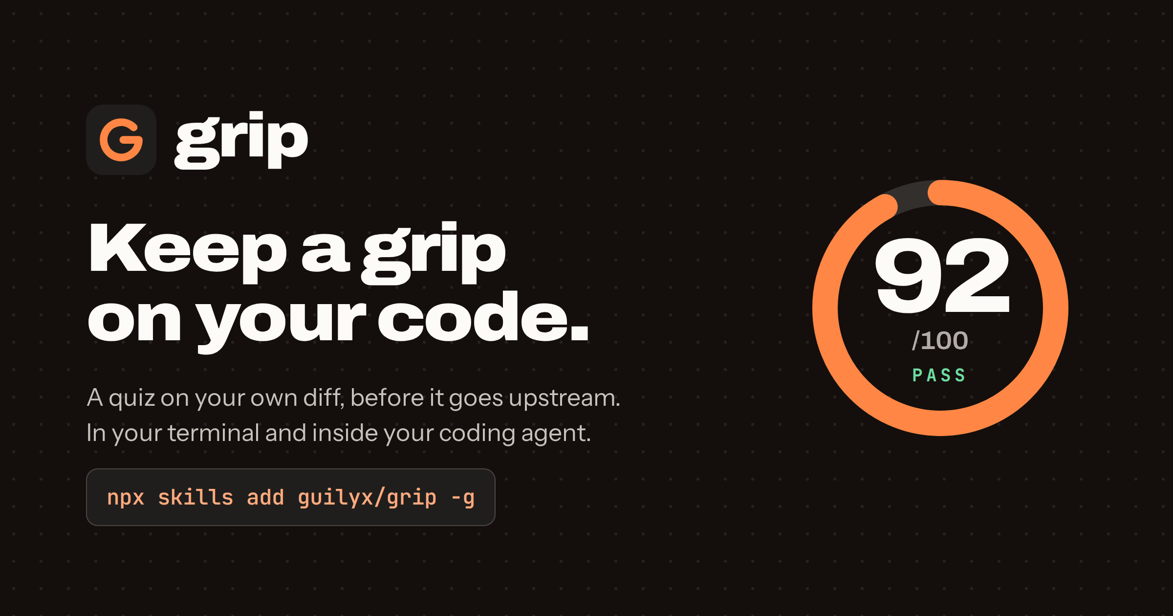
A grip is a hold that is nearly closed. The mark is a score ring drawn to 315 of 360 degrees, 87.5 percent: a pass, never a perfect one. A short bar turns it inward into a G. The same ring shows the Grip Score on the homepage and on the social card.
| File | Use |
|---|---|
mark.svg |
default, ember on a graphite tile, also the favicon |
mark-light.svg |
graphite on ember |
mark-bare-ember.svg |
no tile, for dark surfaces |
mark-bare-ink.svg |
no tile, for light surfaces |
og-card.png |
link previews, 1200 × 630 |


Keep half the tile's width clear around it. The smallest size is 16 pixels with the tile. Never rotate it, close the ring, or set the wordmark in anything but Archivo.
Colour
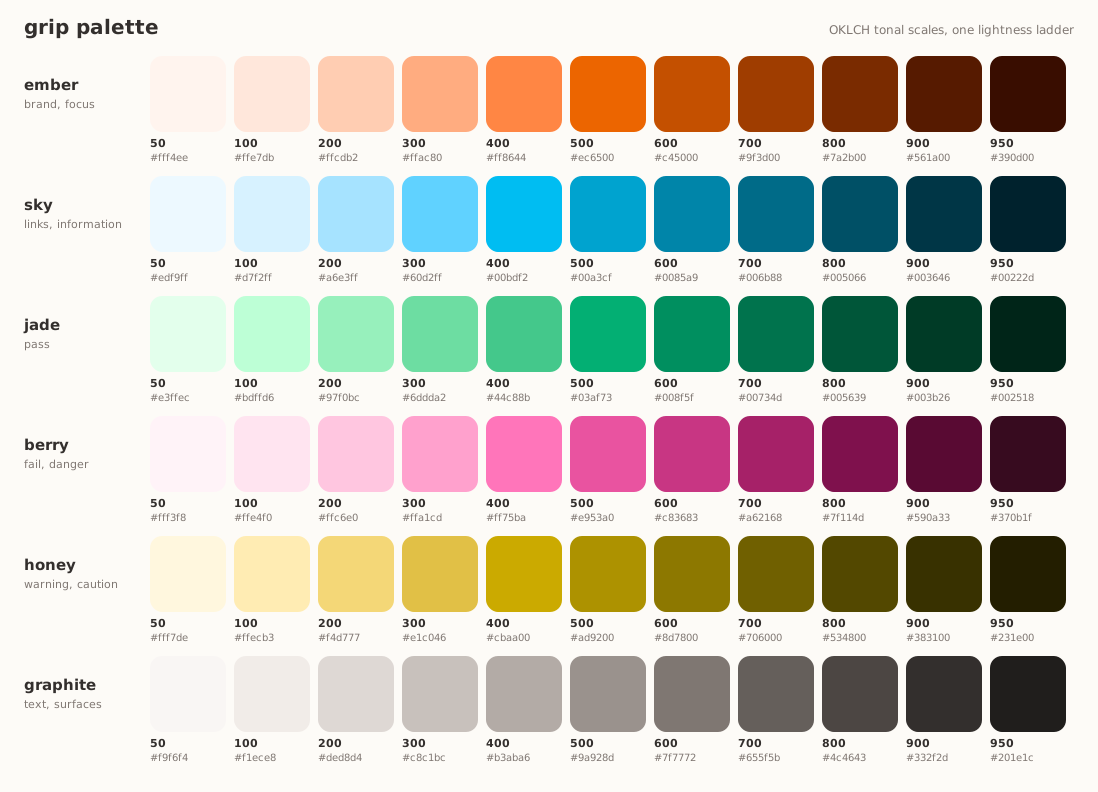
brand, focus
ember-400links, information
sky-500pass
jade-500fail, danger
berry-500warning
honey-600text, surfaces
graphite-950the page
chalkDeveloper tools live in blue and purple. Ember is the orange of safety gear and of a climbing hold you can spot from the ground: "look here" without "error".
How it is made
- OKLCH, not HSL. Equal lightness steps look equal, and hue holds still as chroma changes.
- One lightness ladder for every family, so step 600 weighs the same in ember and in berry.
- A chroma bell: colour peaks mid-scale and keeps a third at the ends, so deep shades are rust, teal, forest and plum, not grey.
- Hue drift: tints lean toward yellow and shades away from it, as pigments do.
- Gamut mapping by chroma only: lightness and hue never move to fit sRGB.
- Complements: ember and sky sit at 46 and 226 degrees, exactly opposite. Orange against cyan-blue is the contrast every colour-vision deficiency keeps. Jade and berry carry pass and fail. Graphite is a neutral tinted toward ember.
What it has to pass
The generator refuses to write a palette that fails any check. 37 checks run today.
- Contrast, measured twice. Every text pairing on this site clears WCAG 2 (7:1 for body text, 4.5:1 elsewhere) and an APCA lightness contrast (Lc 90 for body text, 60 for interface text). That includes every syntax colour in the code blocks.
- Colour vision. Pass and fail, pass and warning, info and fail, brand and fail stay at least five just-noticeable differences apart under simulated protanopia, deuteranopia and tritanopia.
Choices that came out of those checks, not taste: pass is jade rather than the brand orange, because orange reads as a warning and nearly matched fail for deuteranopes. Where two hues sit close for a colour-blind eye, the pair is taken from different steps so lightness keeps them apart. The primary button uses the darkest surface for its label, because vivid orange is only mid-light.
Never colour alone
A score always says PASS or FAIL in words. Colour is the second signal, not the only one.
Type
| Role | Face | Setting |
|---|---|---|
| Display and wordmark | Archivo | 800 to 900, width 112, tracking −0.035em |
| Text | Instrument Sans | 400 and 600, line height 1.6 |
| Code | JetBrains Mono | 500 |
All three are open source and served by Google Fonts.
Voice
- We, not I. grip is a shared habit, not a scold.
- Plain and short. One idea per sentence.
- Honest about limits. Say what is measured and what is not.
- No blame. "Re-read the diff", never "you failed".